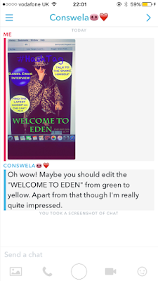
My Feedback
This is some foodback I got to tell me to change my title from green too yellow. I am happy I listened to this advice as I think the title looks much nicer in yellow.
POSTER
Harvey -
Negative
- Too much black
Positive
- Likes vines and font
- Likes it all apart from black
Freddie -
Negative
- Too wide
Positive
- Chosen font and vines
Ollie -
Negative
-
Positive
- Font, tag lines
RESEARCH TRAILER CREDITS
I am doing some trailer research too see what the new trailers put at the end to show the information of the release date, and actors and so on. I have found that most of them just include the date or month that the film is coming out. Bad Neighbours was so vague it only said 'summer 2016', Only one of them had the names of the actors, which shows that this is old fashioned and doesn't really appear anymore. The main information is the only thing that appears at the end. All of them include the production company at the side, which is a must for the end of the trailer. Only 3 of the trailers I analysed had a social media link or icon at the end, which was interesting. I think it looks more effective when there is a Facebook page or website that the viewer can click on.
Noticing the short endings of trailers I wanted to look at older trailers to see if they have changed. They use to be much longer and much more detailed. I much prefer the new style with the shorter and the more important information to just be featured at the end. With all the across names it looks to busy and to long to read.


No comments:
Post a Comment